OCBC in Decentraland: An Immersive Brand Experience Challenge
Project Objective
Create an Immersive Brand Experience in Decentraland: Unveiling OCBC’s Legacy.
Target Audience
Metaverse Users , OCBC Employees and OCBC Customers
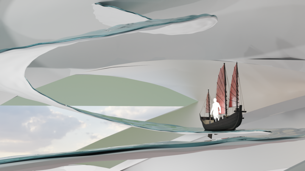
An Amazing Journey
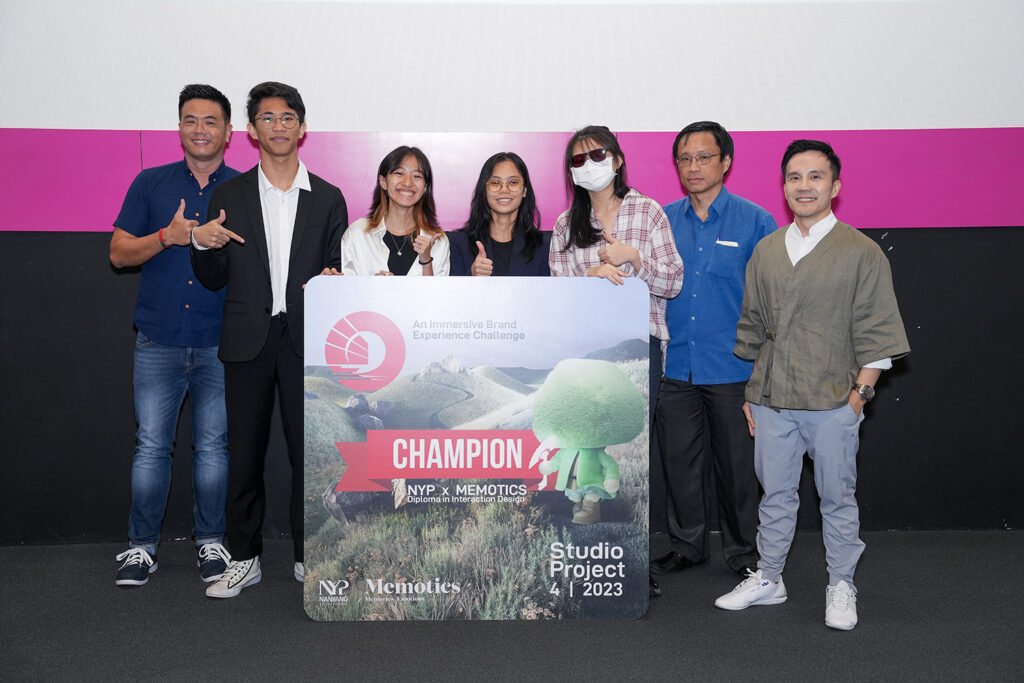
This project was awarded 1st Place!
Personal Words
Working with OCBC as a client presented a significant challenge, demanding a high level of design execution. As part of a four-person UI/UX design team, we had to bring our A-game to deliver exceptional results.
Project Type:
School, Client, Group of 4
Duration:
2 Weeks
Date:
March 2023
My Role
UI Designer
As a UI Designer, I needed to learn and familiarize myself with OCBC’s Branding as well as develop a UI that is progressive in the Metaverse.
Early Stages
We needed to pitch our projects and get it approved before we can continue with it, thus we had to begin our large research on OCBC, Metaverse and the message we want to share.
Research
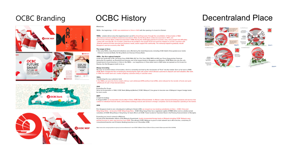
Alot of research went into Current existing OCBC Branding , History and Culture.
Decentraland Research
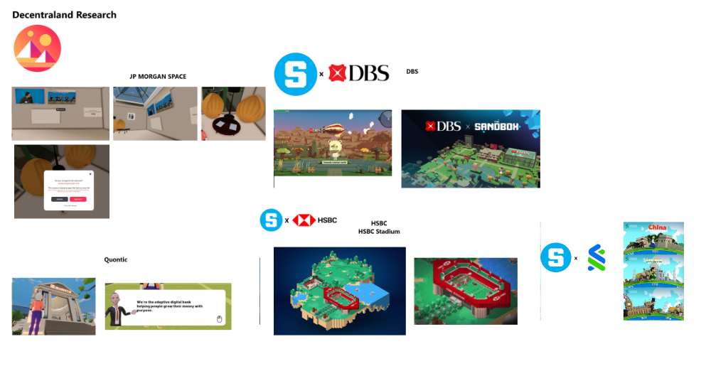
Competitors has already entered the metaverse. Time to see what we can gain from these!
Conceptualization
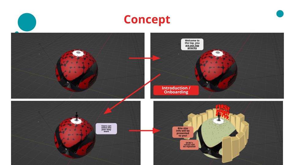
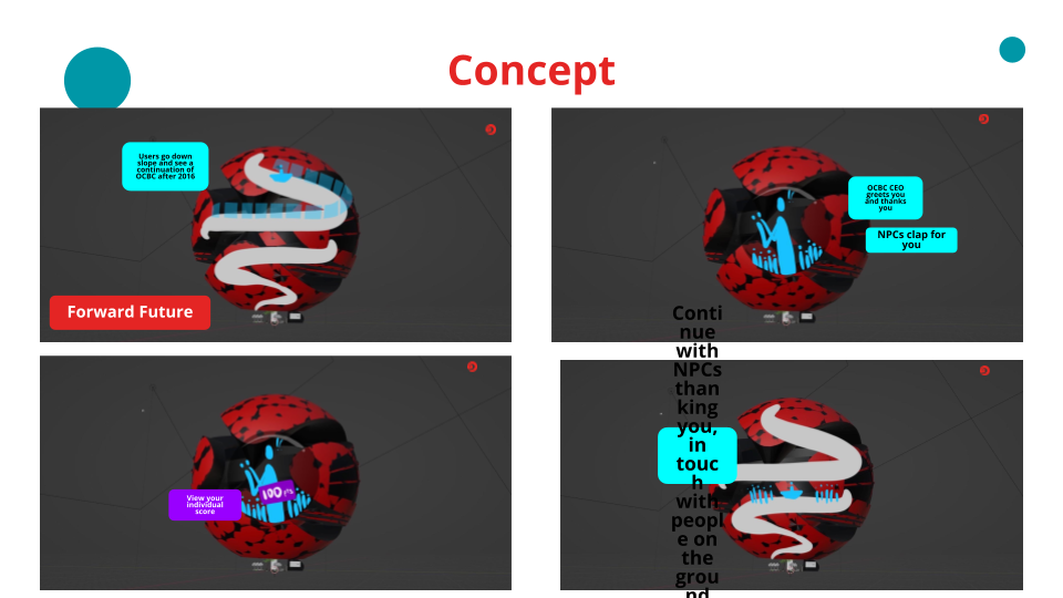
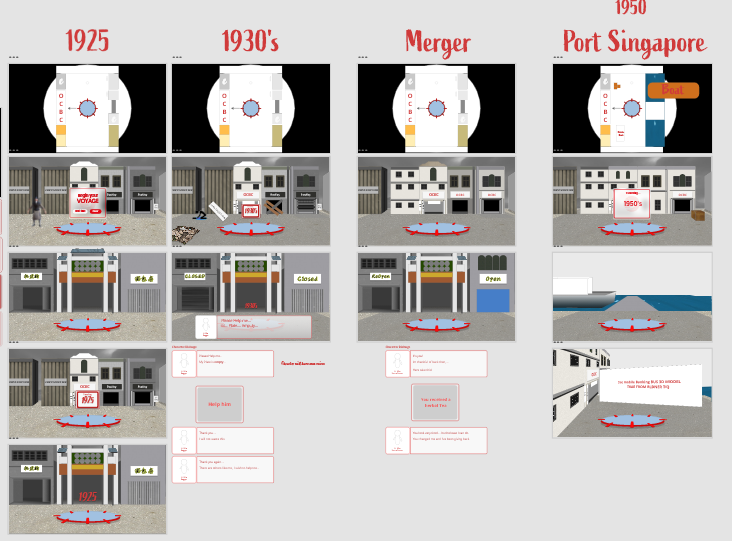
After large amount of research, we brainstormed the experience we want our users to have in the Metaverse!
Our Leader has proposed that we have the experience of OCBC at the top.
With Clunky Gameplay Mechanics, We focus on only using the user’s mouse to enjoy the experience!
We had out project approved
therefore, we began visualising, illustrating & branding and designing for the metaverse and its content.
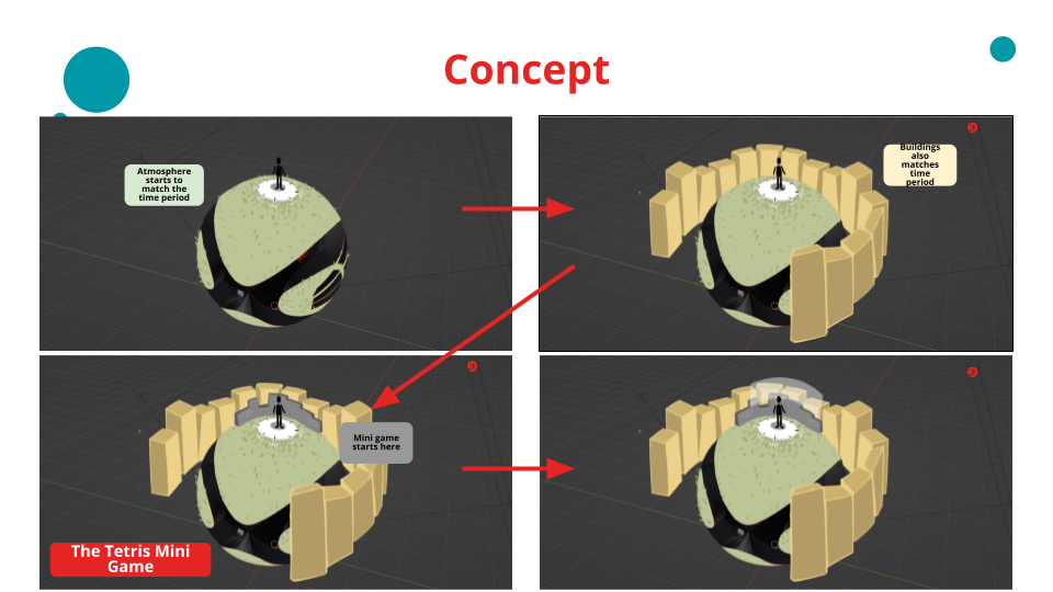
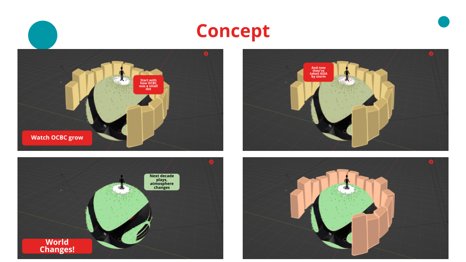
I began with Illustrations
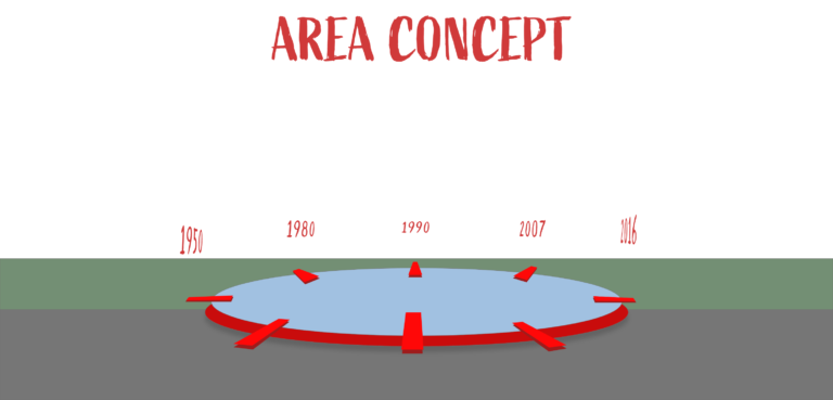
We needed an environment atmosphere and how the story would progress through out the times!
After Helping with illustrations
Comes the User Interfaces
it was a difficult journey as I would reference many other works as well to see how it would look like in a 3D Space.
Most projects I have worked on before this was Mobile or Web. This posed a good challenge for me.
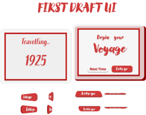
First Draft & Issues
It had issues of branding, typography and visual clarity in-game.
I added background to combat its visual clarity but it was not enough.
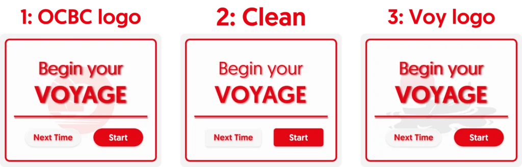
Next Iteration
OCBC branding was showcase more. Change of Typography to match more towards OCBC Geomanist Font.
Final Iteration
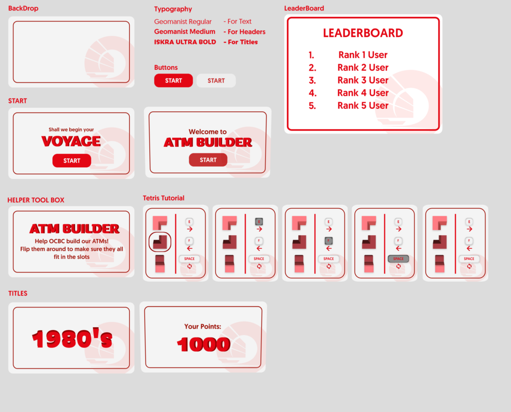
With OCBC Branding, Noticeable Typography, and simple design, This was the final look that was agreed upon.
I developed the other assets required for the experience.
Overall
This project turned out great.
I’ve learned a great deal of UI Development and Iterations to ensure it works in the game. Additionally, It was good experience to be doing this project with my group and learning as much as possible as well.